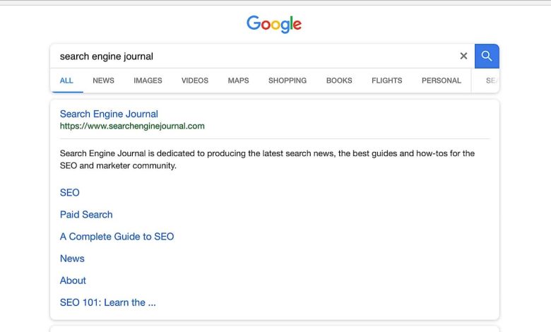
Google has unveiled a new look for its mobile search results, designed to align more closely with the devices on which they’re viewed.
Examining Google’s updated design for mobile search, it’s clear that sharp corners have been eliminated. All search cards, along with the boxes within them, now feature rounded corners.
The newly rounded corner design is well-suited for mobile search. Given that the latest smartphones with edge-to-edge displays also have rounded corners, this new look complements today’s screens effectively.
Alongside the rounded corners, users may also notice that the blue links are brighter, potentially offering a more eye-pleasing experience compared to the previous darker blue color.
When searching for a local business, you might also spot another color change: the review stars on business listings have transitioned from orange to yellow.
Apart from a few aesthetic updates, there don’t appear to be any significant changes to how the search results themselves are presented.
The number of ad units on each page remains the same, local packs contain the same number of listings, and the related searches feature at the bottom remains unchanged.
As this rollout has just occurred and without an official announcement from Google, it’s unclear whether this new design is a test or a permanent update.
Currently, the Google app and desktop site have not adopted this new look, which may suggest that the company is not yet fully committed to the redesign. We’ll need to wait for further information to be sure.


